

In corporate banking, the interface is not a storefront but a working tool where company employees spend hours every week. While a clunky screen in retail costs the bank a lost customer, in the B2B segment, it costs the client working time—which means direct money. A study of SME banking digital maturity in Uzbekistan shows this is exactly where most players leave their most underestimated reserve.
Download the full research (PDF). Data on 20 Uzbekistan banks and 110 parameters, maturity rating, and methodology.
The Short Answer
UX/UI in business banking directly impacts a client’s operational costs: the faster and clearer the interface, the less time accountants and financiers spend on routine tasks. The market’s weakest points are the speed of regular operations, mobile versions, and personalization for employee roles. This is not about aesthetics; it is measurable savings for the business.
Why Business Interfaces Follow Different Rules
Retail apps are designed for one person and one-off actions: transfer, pay, check balance. Corporate interfaces are designed for a team and repetitive scenarios: an accountant creates dozens of payment orders, a financial director approves limits, an executive checks balances across multiple accounts. The same operation is performed not once, but hundreds of times a month. Every extra click and unclear phrasing multiplies by volume, turning into hours of lost time.
Hence the main principle: in B2B, convenience is not measured by “like/dislike,” but by how many steps and seconds it takes to complete a standard task. Good corporate UX is invisible—it simply does not get in the way of work.
What the Research Showed: Three Growth Areas
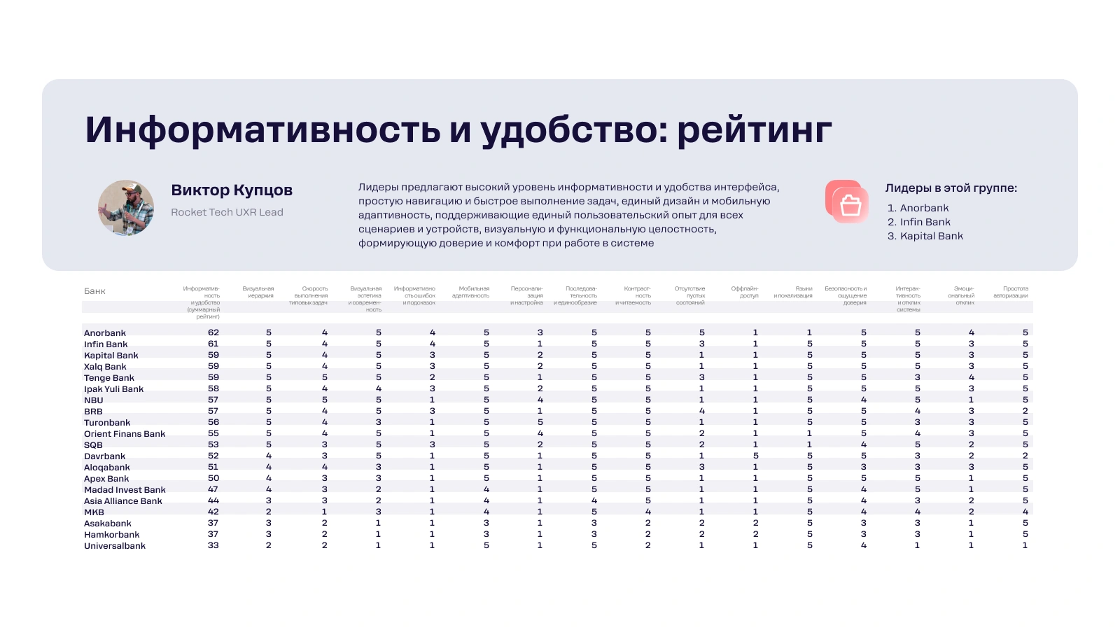
Category leaders according to the Rocket Tech research (“Informativeness and Convenience”): 1. Anorbank, 2. Infin Bank, 3. Kapital Bank.
Speed of Routine Operations
Most banks noticeably lag behind market leaders in the speed and convenience of regular tasks—bulk payments, document exports, repetitive operations. Where leaders allow a standard action in two or three taps, others stretch the same path across extra screens and confirmations. For the client, this is not an abstraction, but concrete minutes an employee wastes every day.
Mobile-First and Adaptability
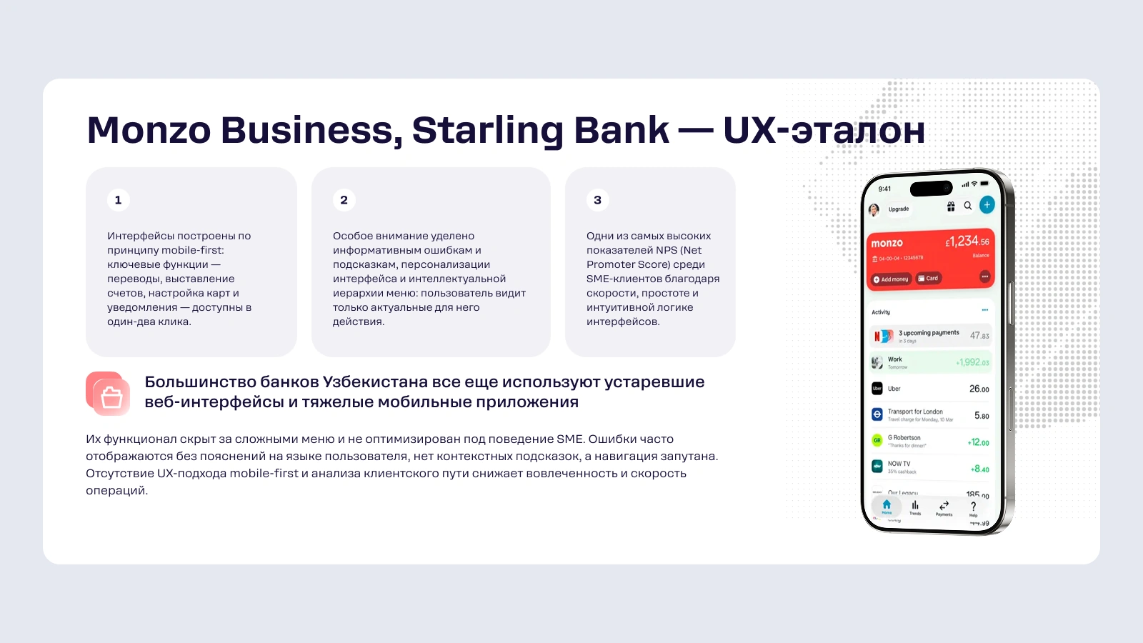
The modern approach, where an app is designed primarily for mobile devices (mobile-first) and adapts correctly to any screen, is far from universal. For a small business owner, this is critical: they manage the company on the go and expect confirming a payment or checking a balance from a phone to be just as convenient as on the web.
Personalization and Roles
Interface settings and adaptation to specific users remain highly limited. Meanwhile, an accountant, a director, and an owner have different tasks and access levels. An interface that shows everyone the same thing forces them all to wade through unnecessary features.
How to Solve It: The Approach to Corporate Banking UX
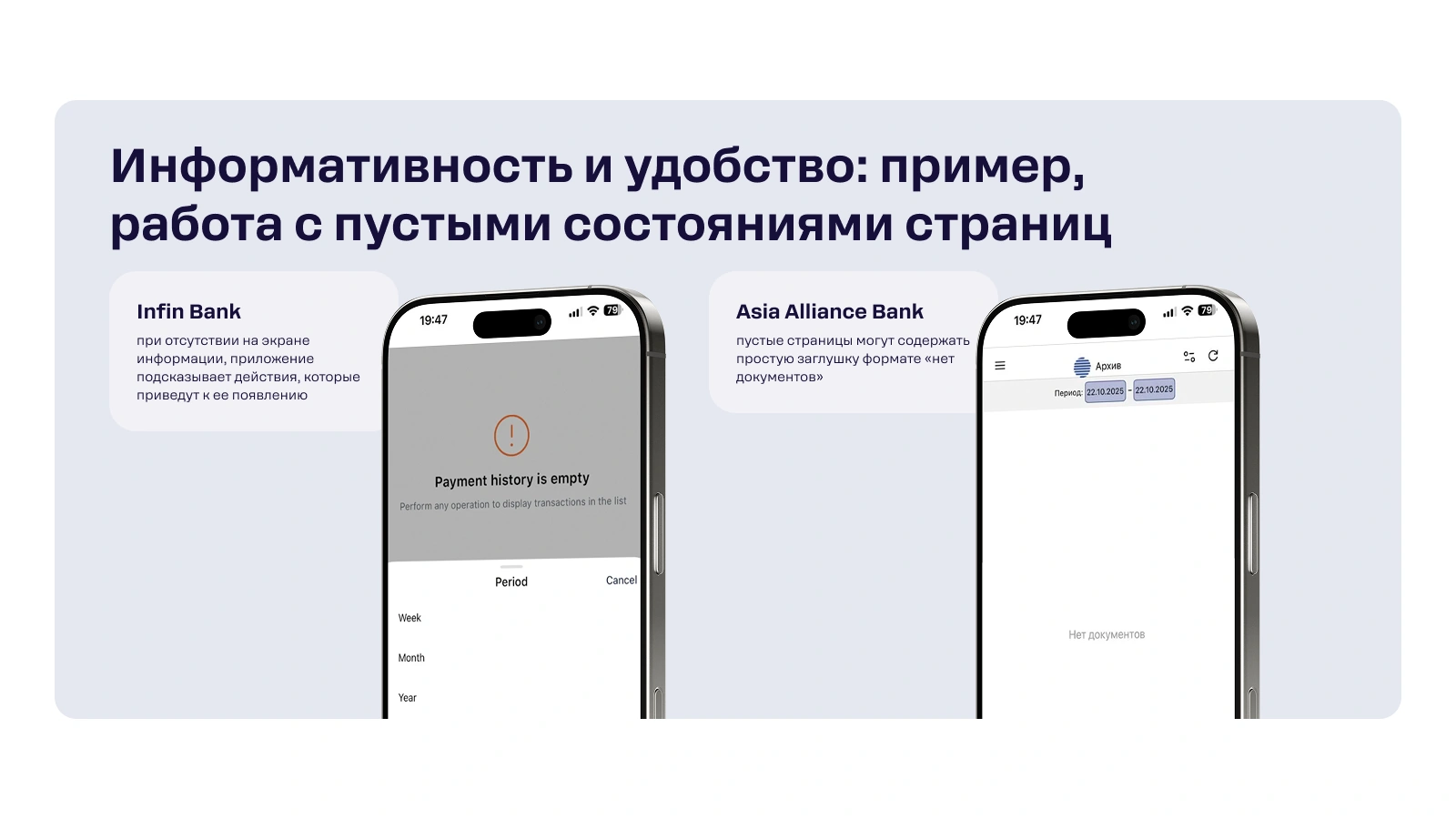
The gap between leaders and the rest is closed not by cosmetic redesigns, but by working with scenarios. In practice, this means three directions:
- Optimizing scenarios and navigation. First, determine which tasks clients perform most often, then shorten those paths to the minimum number of steps. A redesign starts with a map of actual user actions, not a picture.
- Unified visual language and role-based dashboards. A single style across all sections reduces cognitive load, while individual panels tailored to a role (accountant, director, owner) show everyone only what they need for work.
- Simplifying login without losing security. Biometrics and multi-factor protection remove friction during authorization while maintaining the security level required for corporate data.
Rocket Tech does exactly this: scenario audits, role-based interfaces, and mobile apps for banks and fintech. The goal of such UX is not to “make it pretty,” but to cut the client’s time on routine tasks and offload bank support.
Why This Matters for the Bank
A bad interface means more than just unhappy users. It means more expensive support (clients call and write about every unclear step), slow onboarding for new companies, and churn to competitors who are “simply more convenient.” In the SME segment, where clients choose banks rationally and easily compare products, mature UX becomes a direct competitive argument, not a nice-to-have addition.
FAQ
What is UX/UI in the context of business banking?
It is how a corporate banking app interface is structured and how quickly and clearly company employees perform work tasks in it—from bulk payments to limit approvals. In B2B, convenience is measured by saved working time, not just appearance.
Why is mobile-first important for business apps?
A small business owner manages the company on the go and expects key operations—confirming a payment, checking a balance—to be accessible from a phone just as conveniently as on the web. If the mobile version is stripped down or clunky, the bank loses standing with the client, even with a strong web presence.
How do you know if a bank’s interface is costing a business money?
Indicators include the number of steps for a standard operation, the time for a bulk payment, the frequency of support requests regarding “unclear” screens, and the onboarding speed for new employees. If a routine task requires extra clicks, the client pays for these costs with their working time.
These are insights from Rocket Tech’s research on SME banking digital maturity in Uzbekistan.
